
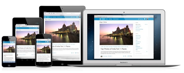
A few weeks ago, WordPress.com announced the beginning of ongoing improvements to responsive web design features for its websites. Responsive web design allows a site to be properly displayed and visually appealing, regardless of whether a website is being viewed on a desktop, tablet, or smartphone.
WordPress is one of several content management systems Byte Technology uses to develop websites for its clients. We strive to stress the importance of responsive design for websites, and we welcome WordPress.com’s improvements to this feature on their system. In the current web environment, a properly built website should adapt to any new screen size that comes out on the market.
Why is this visual responsiveness so important? Consider a few facts:
- The numbers of smartphone users are growing exponentially.
Near the end of 2012, the number of smartphone users in the world passed the 1 billion mark. “It’s taken 16 years to pass 1 billion, “ said Ingrid Lunden of TechCrunch, “but the analysts believe it will only take three years for the next billion smartphone users to come on board.” - Web traffic from mobile devices is also growing exponentially.
Mediabistro reported that between December 2011 and December 2012, mobile device traffic increased 84 percent. At the end of 2012, mobile web traffic accounted for 23 percent of total website visits. (Mobile devices include smartphones and tablets.)
The use of mobile devices to access the web is only going to continue to grow. A website with responsive design will communicate its messages and reach its audiences more effectively than a website without the responsive features.

