
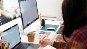
Web design is constantly evolving to meet the needs of the designers who propel our tech-driven world. And leading that evolutionary charge are tools that enable those designers to build websites faster and with greater efficiency, opening new possibilities for creativity and original thinking in an industry that sometimes gets bogged down in the mundane.
In an article posted online just a few months ago, web designer Leigh Howells coined an interesting term for these next-gen products: “codesign” tools. And he broke down exactly how three of these tools—Webflow, Adobe Edge Reflow and Macaw—are poised to revolutionize how designers build immediately responsive sites from the ground up.
Adobe Edge Reflow
Designing with Reflow is, as Howells puts it, based on drawing divs—the elements that define logical divisions within the document—onto an actual browser and moving and styling them with CSS. Reflow provides frameworks that help ease the complexity of building responsive websites that require supporting applications such as Dreamweaver. Essentially, working with Reflow—which is built on a fluid grid-based layout system that allows for customizable numbers of grid columns and gutter sizes—allows designers to build sites that are responsive from the start.
Webflow
Like Reflow, Webflow allows designers to build production-ready, responsive sites—ones that render perfectly across multiple browsers—without actually writing code, which the product generates itself. Webflow also automatically constructs valid markup and stylesheets that ensure the code is clean; eliminates the need for media query code in a text editor; and allows a designer to hand off a Webflow project to a developer if custom programming changes are needed.
Macaw
The Macaw homepage says it all: “stop writing code, start drawing it.” The product provides the flexibility of a designer’s favorite image editor while taking the task of writing HTML and CSS out of their hands. It also optimizes web and system fonts; allows for remote previews on a dedicated network; utilizes static, absolute and fixed positioning for dynamic layouts; and provides an easy storage library for elements so they can be reused on any page of a site.
Howells is quick to note that although designers will still be creating “art” elements in design packages for now, he envisions a day when a codesign tool will by so thoroughly encompassing that it will be the only tool a designer really needs.
