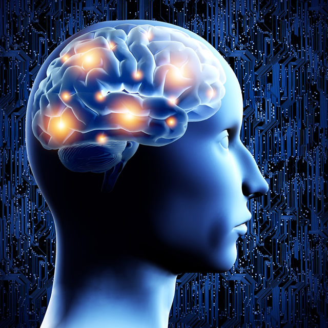
If space is the final frontier, the brain is a close second. Even today, with medical advancements occurring daily, scientists have been able to answer only a fraction of the questions on how the brain works, how it processes information or reacts to stimuli, or why certain experiences embed themselves in a lasting way while others are fleeting.

The Internet, on the other hand, could aptly be described as a “new frontier,” where equally stunning advancements happen daily as well, constantly pushing the boundaries of communication. And while website designers are constantly bombarded with a litany of tips, trick and shortcuts, it’s interesting that many of those are based on the science of the brain, a unique marriage of science and media. In short, the brain’s “tendencies” can be put to work by serious designers intent on creating websites that the user—in reality—can’t forget even if they wanted to. Check out these five design methods based on actual brain science:
• When compiling any lists in the site’s copy, put the important things at the beginning and end, as a reader’s attention wanes in the middle. This is because the frontal lobe, associated with planning and logic, contains the short-term memory and only holds around seven items.
• Humans tend towards a “herd mentality,” also thanks to the frontal lobe which controls motivation. So make sure your design incorporates some sort of message that lets the reader know others having chosen the product or service: this could include testimonials from clients, reviews or endorsements.
• Always opt for readability in your copy. The temporal lobe, responsible for language comprehension and meaning, thrives on familiar and common words. Avoid long sentences, jargon or fancy words that have the potential to make a reader doubt their own intelligence and is likely to lead to inaction.
• The occipital lobe is extremely sensitive to visual differences, especially color. In fact, studies show that the brain can remember more items if they’re a different color. So pick one color for “action items” such a clickable links and another color for “passive items” such as informational text and general copy.
• Thanks to the amygdala, which controls eye tracking and emotions, headlines and landing page images are looked at more than anything else on a website. So use headlines and images that evoke emotion, regardless of whether it’s positive or negative.
++++++++++++++++++++++++++++++++++
Byte Technology is a premium Minneapolis/Bloomington Web Design company providing custom web design and development services for medium to large businesses in Minnesota, as well as nationally. To speak with a web representative about this article or schedule an open office hour session, please call (612) 204-4921.


